

In a digital ecosystem where the cost of acquisition (CAC) on Google and Meta is skyrocketing, continuing to pour advertising budget into a site that doesn't convert is like filling a leaky bucket. Conversion Rate Optimization (CRO) is no longer a tactical option, it's a profitability imperative.
The goal is not just to change the color of a button, but to adopt a scientific approach to turn your existing traffic into revenue. Here's how Welyft structures this approach, from behavioral psychology to data analysis.
What is CRO?
CRO (Conversion Rate Optimization) is often reduced to simple A/B tests. In reality, it's an iterative process that combines three disciplines:
- Data Analytics: To know where you're losing money.
- Cognitive Psychology: To understand why your users aren't taking action.
- UX/UI Design: To offer a smooth and intuitive solution.
Contrary to popular belief, CRO isn't just about generating immediate sales. It allows you to innovate with lower risk by validating your product hypotheses and to inform your overall strategy through better customer knowledge.
Understanding your users' brains
A visitor doesn't make 100% rational decisions. They are influenced by psychological mechanisms that you need to master in order to optimize your journeys.
1. Cialdini's 6 principles of persuasion
These principles are the foundation of any converting journey:
- Social Proof: "80% of our customers recommend this product". Humans imitate group behavior to reassure themselves.
- Scarcity: "Only 2 items left in stock". Fear of missing out (FOMO) speeds up decision-making.
- Authority: The use of badges, certifications, or expert opinions builds credibility for your offer.
- Reciprocity: Offer value (free guide, audit, advice) before asking for a purchase.
- Commitment: A user who begins an action (e.g., the first step of a form) is more likely to complete it for the sake of consistency.
- Likability: A brand that humanizes its relationship (Storytelling, "About" page) converts better.
2. The art of nudges and cognitive biases
The brain is always looking for shortcuts. In CRO, we use these biases to streamline the experience:
- Anchoring bias: The first price seen determines the perception of the following ones. This is why the display order of your products is critical.
- The Decoy Effect: Offering an unattractive intermediate option to make the "Premium" offer more appealing.
- Nudges: Pre-selecting the most popular option or using positive wording ("I'm claiming the offer" vs "Continue").
3. Gestalt theory for UX
Before reading, your user "scans". Gestalt theory explains how the brain visually organizes information:
- Law of Proximity: Elements that are close together are perceived as related. A purchase button should be placed right next to the price and the product photo.
- Law of Similarity: Your Calls-to-Action (CTAs) should share the same visual style to be identified instantly.
- Law of Continuity: Use design to guide the eye toward the conversion area (lines of force, characters' gaze).
The LIFT model: The conversion equation
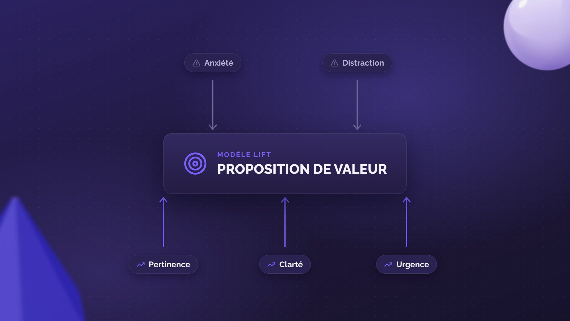
How do you know if a page is optimized? At Welyft, we use the LIFT model to audit landing pages. It's a simple equation:
Conversion Probability = (Relevance + Clarity + Urgency) - (Distractions + Anxiety)
- Relevance: Does the content match the ad's promise (Message Match)?
- Clarity: Is the value proposition understandable within 5 seconds?
- Anxiety: Have you removed the barriers (Payment security, Return policy)?
- Distraction: Remove everything that diverts attention from the goal (outbound links, overly dense menus).
The Welyft 4-step analysis methodology
Having the theories is one thing, applying them is another. To detect growth opportunities, we apply this rigorous analysis framework.
1. Segmentation
Analyzing an overall conversion rate is a beginner's mistake. You need to break down your audience to see the reality.
Example: Your conversion rate is stable, but by segmenting, you discover that Desktop is rising while Mobile is collapsing.
2. The hunt for friction
We track breaking points in the journey.
Warning indicators: An abnormally high bounce rate on a key page or too short a time spent on a content page. This is a sign of a mismatch between expectation and reality.
3. "Wide gap" analysis
We compare performance between segments to isolate technical or UX anomalies.
Key question: Why is the conversion rate 3x higher on iOS than on Android? Is there a technical bug or a specific interface issue?
4. Flow analysis
The user doesn't always follow the linear path you imagined. Thanks to GA4's exploration reports ("User path"), we identify unnecessary navigation loops and dead ends that frustrate your visitors.
Move from intuition to science
CRO isn't magic, it's a methodology. By applying these principles of psychology and analysis, you stop guessing what works and start knowing it.
Would you like to audit your current site's performance?
Our experts can carry out a complete diagnosis of your customer journeys.